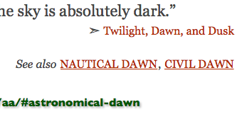
See also
For the web links on the definitions, I wanted it justified on the right. I was also tired of hand entering the line breaks. I wanted to automate it a bit. So here is the CSS.
.defref {float: right; width: 60%; font-size: .7em; text-align: right;}
It looks good but it's complicated.

Here's the code.
<br><div class="defref">
➣<A HREF="http://www.lifezette.com/polizette/the-shadowy-extremist-group-behind-the-anti-trump-riots/" target="blank">The Shadowy Extremist Group Behind the Anti-Trump Riots</a></div></div>
<div style="width: 33%; height: 1em;"></div>
</p><div style="text-align: center;"><a class="button" style="font-size: smaller; font-style: italic;" HREF="#Aa-box"> index </a><br><span class="emphatic" style="font-style: normal; font-size: 90%;">http://www.neowayland.com/lexicon/aa/#antifa</span></div>
With the float property, the hack in red becomes pretty important. That keeps the next element, in this case the index button, from drifting up the page. It's also the bit that lets me fine tune the spacing manually.
I used a <br> to begin with because this is the weblink that I quoted from. If it had been just some related links, I would have used a </p>.
Here's a picture that combines the two.


