


Lexicon entries
Wednesday, 06Feb2019 Filed in: Webmaster
Technopagan Yearnings has two types of lexicon entries and one variation.
The first is for the stuff I wrote. Yes, I was thinking of sticky notes when I chose the color.
And here's the CSS.
Here's an example of when I am quoting another in the lexicon.
And here's the CSS.
Except for adding the ghoster quotes and changing the box definitions, these are identical to the entries that I wrote. But they are very visually distinctive.
We're not done there. I have definitions that I don't agree with or that are dangerous, and those need a different feeling.
And here is the CSS.
I just changed the red banner to a gradient, because of the colors I picked it looks like it is fading and more in line with the scrapbook feel. It's subtle, but definitely there.
You can see how the whole thing works here.
The first is for the stuff I wrote. Yes, I was thinking of sticky notes when I chose the color.
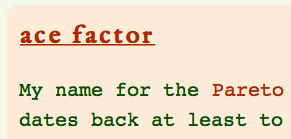
Here's the HTML.
<!—new entry—><blockquote class="defbox">
<h1 id="ace-factor" class="word"><A class="nwc" HREF="/files/tag-ace-factor.html">ace factor</a></h1>
<div class="mydef">My name for the <A HREF="https://en.wikipedia.org/wiki/Pareto_principle" target="blank">Pareto principle</a> or the 80/20 rule that dates back at least to the Roman Republic. Writers at the time knew that if you isolated the right 1 out of 5 prisoners from the others, the rest became nearly docile. In WWII, the U.S. Army Air Corps discovered that roughly 20% of the combat pilots delivered 80% of the kills. The Army Air Corps studied combat aces to identify the traits. The regular Army found that a similar ratio held for tank commanders.</p>
All that work just showed that aces had a certain irreverence for authority, an incredible drive to get the job done, and a certain intuition that defied any kind of classification.</p>
The really freaky bit is that without those “aces” well distributed and highly visible to the rest of the service, the service’s effectiveness could drop by nearly half. <strong>We need our heroes clearly in sight.</strong> Today in business the 80/20 rule usually means that 80% of your business comes from 20% of your clients, but versions of this rule exist all over. Just remember it’s not necessarily universal.</div>
</p><div style="text-align: center;">
<a class="button" style="font-size: smaller; font-style: italic;" HREF="#Aa-box"> page index </a><br><span class="emphatic" style="font-style: normal; font-size: 90%;">http://www.neowayland.com/lexicon/aa/#ace-factor</span></div></blockquote>
And here's the CSS.
.defbox {background-color:#FAEBD7; padding:13px; border-radius: 13px; margin-bottom: 1.3em;}
.word {letter-spacing: .1em; color:#333333;}
.mydef {font-family: Courier; color:#0A4F00; font-size: 1.3em;}
.defref {float: right; width: 60%; font-size: .7em; text-align: right;}
.word {letter-spacing: .1em; color:#333333;}
.mydef {font-family: Courier; color:#0A4F00; font-size: 1.3em;}
.defref {float: right; width: 60%; font-size: .7em; text-align: right;}
Here's an example of when I am quoting another in the lexicon.
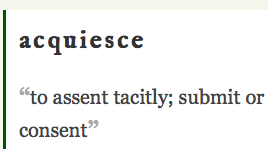
Here's the HTML.
<!—new entry—><blockquote class="defbox2">
<h1 id="acquiesce" class="word">acquiesce</h1><div class="def"><span class="ghoster">“</span>to assent tacitly; submit or comply silently or without protest; agree; consent<span class="ghoster">”</span><br>
<div class="defref">➣ <A HREF="http://dictionary.reference.com/browse/acquiesce?s=t" target="blank">dictionary.reference.com/browse/acquiesce?s=t</a></div></div><div style="width: 33%; height: 1em;"></div>
</p><div style="text-align: center;"><a class="button" style="font-size: smaller; font-style: italic;" HREF="#Aa-box"> page index </a><br><span class="emphatic" style="font-style: normal; font-size: 90%;">http://www.neowayland.com/lexicon/aa/#acquiesce</span></div></blockquote>
And here's the CSS.
.ghoster {font-weight: 900; font-size: 113%; color:#A9A9A9;}
.defbox2 {border-left:3px solid #0A4F00; border-radius: 0px 13px 13px 0px; background-color: white; padding:13px; margin-bottom: 1.3em;}
.def {font-family: Georgia; font-size: 1.3em;}
.defbox2 {border-left:3px solid #0A4F00; border-radius: 0px 13px 13px 0px; background-color: white; padding:13px; margin-bottom: 1.3em;}
.def {font-family: Georgia; font-size: 1.3em;}
Except for adding the ghoster quotes and changing the box definitions, these are identical to the entries that I wrote. But they are very visually distinctive.
We're not done there. I have definitions that I don't agree with or that are dangerous, and those need a different feeling.
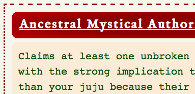
This leaps out at the reader. It still uses elements from the other entry types, but there is no denying that this is very different. Here's the HTML.
<!—new entry—><div class="caution">
<h1 id="ancestral-mystical-authority" class="redword"><A HREF="/files/tag-ancestral-mystical-authority.html" class="rednwc">Ancestral Mystical Authority</a></h1><blockquote class="defbox" style="margin-bottom: 0em;">
<div class="mydef">Claims at least one unbroken line of magick workers with the strong implication that their juju is better than your juju because their ancestors did it better and longer and that True Magick is only passed through the ancestor’s blood. Often used as a distraction to keep other people from noticing that the claimant lacks <ol style="margin-left: 3em;">
<li>ability,</li><li>training,</li><li>common sense,</li><li>experience,</li><li>lineage, or</li><li>any or all of these things.</li></ol> Basically it’s a big “Shut the Fuck Up!!” to any one else present who might have another way. Used by certain pagan authors who want to become <A HREF="/lexicon/bb/#big-name-pagan.html" class="lexicon">Big Name Pagans</a>.</div></p><div style="text-align: center;"><a class="button" style="font-size: smaller; font-style: italic;" HREF="#Aa-box"> page index </a><br><span class="emphatic" style="font-style: normal; font-size: 90%;">http://www.neowayland.com/lexicon/aa/#ancestral-mystical-authority</span></div></blockquote></div>
And here is the CSS.
.caution {border-top: dashed 3px #8B0000; border-right: dotted #8B0000; border-left: dotted #8B0000; border-bottom: dotted #8B0000; padding: 13px; margin-bottom: 1.3em;}
.redword {border-radius: 15px 33px 33px 15px; letter-spacing: 2px; color: white; background-size: auto; background-image: radial-gradient(#8B0000, #800000, #B22222); padding: .3em; margin-bottom: .3em;}
a.rednwc:link, a.rednwc:visited {padding: .3em; text-decoration: underline; background-size: auto; background-color: transparent; color: white;}
a.rednwc:hover {color: white; font-size: 113%; background-color: transparent; background-image: none; text-decoration: none; font-weight: 700; none; text-transform: none;}
I just changed the red banner to a gradient, because of the colors I picked it looks like it is fading and more in line with the scrapbook feel. It's subtle, but definitely there.
You can see how the whole thing works here.
blog comments powered by Disqus