Changing design
The first one was done entirely with tables. I was very proud of that, it was a lot of work. This is a screenshot.
This next one was also done with tables but was meant for the inside pages.

I simplified that so at least the text elements were a graphic.

This one was when I was redoing the whole site and needed a placeholder. This was the last one before the www.neowayland.com address.

This one never made it online.

Then I had too much green.

Here's a low res version.

Getting closer now.

A little closer still. I experimented a lot with this.

This one was the first "carved" version.
Here's the first "ribbon" version.
Another "ribbon" version.

And this one I think is the final version.
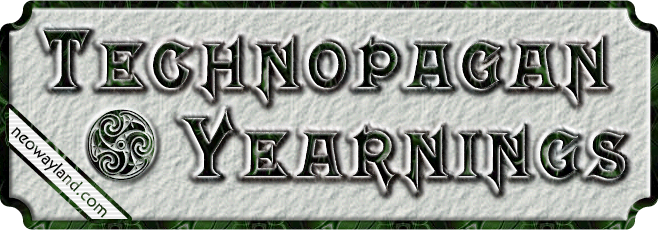
Notice that over more than a dozen years, I kept the same basic elements in all of the logos. I even used the same three fonts for the title.


