|
|
|
|
|
Posted on Tue - June 24, 2008 Designing the messageGrabbing attention in a hurry UPDATED
to fix iPhoto bug.
One of the things that has been taking my time
lately is a small design business I have on the side. It doesn't pay much,
barely enough to meet expenses, but it does let create every once in a while.
One of the things that grew out of my business card designs is a MemeCard.
MemeCards get attention in three to five seconds and sell the message is twenty
to thirty seconds.
They actually started as motivational tools. I used a couple of ideas from Disney's "Meet the Robinsons" on one as a combination sample/ad giveaway and it just took off from there. Here's one that I put together for Pagan Vigil, my mainstream political blog. 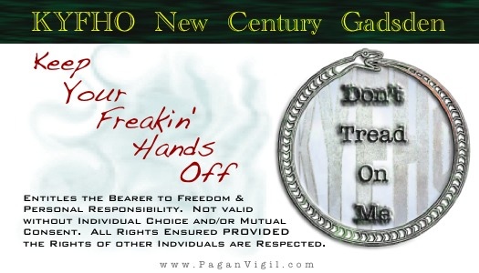
I just one to touch on a couple of points in the design. Up at the top, green and gold suggest money. That is why many upscale banks used to use green marble. By using the "engraving" font and keeping a sharp line of separation, I encourage this association. The "bearer" bit at the bottom is carefully worded to build on this idea, and the font I used there reinforces that. There's also this subtle thing about a Gadsden being a unit of currency. The red letters on the pale blue are in stark contrast to the "banker" bit at the top. With the handwritten font, there is just a touch of "I'm mad as hell, and I'm not going to take it anymore!" Notice that this is the second mention of KYFHO. My version of the Gadsden flag comes next. Of course, the "Don't tread on me" stands out, but by using this particular design, I've worked KYFHO in yet again. By making the web address small with gray letters, it becomes secondary to the message on the card. In other MemeCards, I have the name of my design business and an email address. All in all, the card gives the impression that it is as much a public service message as a advertisement. |
Hello There
This is my no frills blog to cover all the gadgets and gizmos and technology that makes 21st Century life so exciting. Think of it as a messy set of notes that I keep for myself on all sorts of topics. It's really intended for my personal use, but I will explain sometimes as I go along.
My passion is for Macintosh and other Apple products, but I will use others as needed. If my notes and experiences can help or amuse you, so much the better. Categories
Calendar
Archives
XML/RSS Feed
Neolinks
Homepage AOL Homepage Geocities Homepage Dot Mac Homepage PaganVigil AOL Pagan Vigil Geocities Pagan Vigil Dot Mac Pagan Vigil Technopagan Yearnings AOL Technopagan Yearnings Geocities Technopagan Yearnings Dot Mac Technopagan Yearnings Webmaster NetworkSolutions Dot Mac dotmac.info WhatTheFont MacHighway America Online Yahoo! Geocites ZoneEdit iBlog HaloScan StatCounter Feed to JavaScript Performancing Design Re-Imagineering Steampunk Workshop Design Observer Subtraction Paleo-Future Hardware Apple CDW Cyberguys PCMall X-Treme Geek Software TypeStyler Graphic Converter Palm News & Info Palm Infocenter Brighthand Forums - Palm mytreo.net Making Music Apple - iLife - GarageBand iCompositions Royalty Free Music, Free Sound Effects, Royalty-free Sounds Tune Up Loops Twin Cities MIDI Home Page Andy's OSX Music Page Apple Logic Pro - AUDIO Hints & Tips Library of scanned player piano music rolls Garritan Orchestral Libraries Drums on Demand Bandmateloops Coolness Gizmodo Engadget Daring Fireball RoughlyDrafted Magazine Applefritter iGeek MaKiDo Mac vs. PC Info Why I Hate Microsoft World of Ends Tracking What Is My IP Address? IP Address Trace Geektools WHOIS ARIN WHOIS Database Search Zabra People Search NeoBlogs

Statistics
Total entries in this blog:
Total entries in this category: Published On: Dec 07, 2008 01:28 PM  |
||||||||||||||
